Middle East Vegan Society
LOGO, BRAND IDENTITY, ILLUSTRATIONS
The Project
The Middle East Vegan Society (MEVS) is an organization with a primary focus on mitigating and eradicating the suffering experienced by animals, alongside lessening our environmental impact through everyday choices, by promoting awareness about animal rights and advocating for plant-based eating. They expedite and meticulously document the transformative growth of veganism on a global scale, with a specific emphasis on the often overlooked MENA region (Middle East & North Africa).
Our Approach
Since the organization primarily promotes friendly, easy-on-the-eye content, and a motivational and educational approach to raising awareness, they needed a brand to reflect these qualities. A high-quality mark that incorporates these personality traits as well as an Arabic/Middle Eastern visual influence would fit perfectly.

The Logo
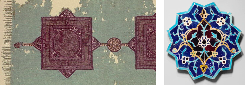
Middle Eastern designs are distinctive and an obvious choice for influencing the MEVS logo. We gathered inspiration from tapestry and tile designs, often geometric but also rich in intricate vine work and details. We opted for a bold geometric shape as the base, with some more organic leaf-inspired details on the inside. This radial symmetry is eye-catching and instantly recognizable.
Brand Identity
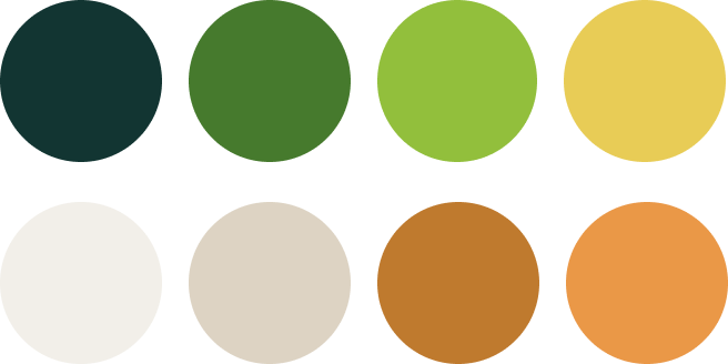
Of course, the color palette is inspired by the traditional green tones found in vegan branding, but earth tones have been added for uniqueness and a warm, friendly, approachable look and feel.

Illustrations
We created branded illustrations for the MEVS website to add a friendly and approachable feel. The background shape is inspired by the geometric logo shape.
Website Design
We redesigned the MEVS website to better reflect the vibrancy and uniqueness their voice brings to the vegan movement and to the world at large. We made full use of the brand palette, incorporated patterns and textures to pull in visual interest, and aligned the fonts and imagery to match with their social media posts to unify their online presence.

Sub-Branding: Greener Food
When MEVS launched their Greener Food program, it needed to visually tie into the core brand. We used the same intricate tile pattern from the core logo and broke it out of the geometric shape. A globe image is used to represent sustainability and global health, with the globe centered over the Middle East.


