Plant Based Data
LOGO, BRAND IDENTITY
The Project
Plant Based Data was created by a group of researchers as a reliable reference library of studies and data related to plant-based food systems. To bring about a better future, changemakers need high quality research and analysis from credible sources as the foundation for meaningful, evidence-based progress. They created PBD as a free resource for all.
Our Approach
When it comes to presenting large amounts of data, perceived credibility is vital. We worked with the PBD team to come up with a brand that not only represented their focus on the environment, sustainability, and health, but also embodied their highly rigorous, scientific, and academic values.


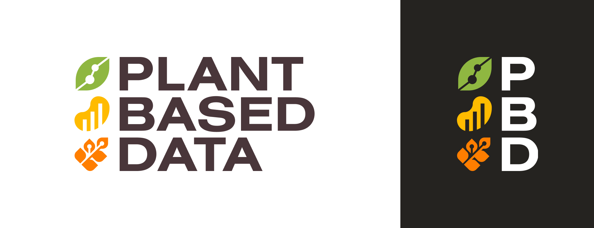
The Logo
The logo symbols merge classic chart shapes with plant-based symbols. We included grains, greens, and plant-based proteins in the symbols to represent a complete diet. The three symbols match the rhythm of the three-word title, making it easy for the viewer to absorb both the text and image at once.

Brand Identity
The color palette is a more modernized and saturated take on more traditional earth tones – a deep brown serves as a high-contrast base, while the bright green, gold, and orange pop out boldly to catch the viewer’s eye.


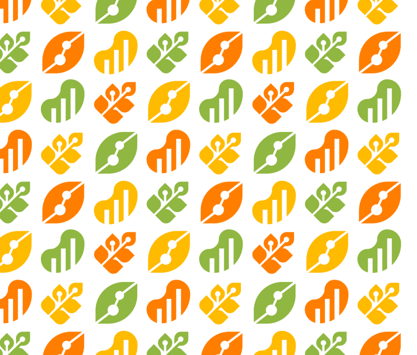
Repeating Pattern
The logo symbols are flexible, and work well in repeating patterns. This pattern can be bold when used in full-color, or it can be a more subtle touch when used in tone-on-tone brown backgrounds.
“The designers at Violet Studios were immensely helpful in creating our new logo for PlantBasedData.org. We were all so impressed by their talent and creativity, and the quality of work delivered. A genuine interest in what and how we want to be represented was taken, and the logo created perfectly represents us. The VS team also generously helped with some other design tips around our site. Thanks again! ”